Brand-driven transformation of a large health insurance company
Kaufmännische
Krankenkasse.
For more than 20 years, Kaufmännische Krankenkasse, or KKH for short, had neither regularised brand management nor a defined brand positioning - until it finally brought gmk on board. We conducted a brand audit for KKH in 2019, and our actual collaboration began in 2021. The goal: a fresh start for KKH, with a strong positioning and meaningful design.

DATA-DRIVEN BRAND RELAUNCH FOR KKH
At the beginning of our work with KKH, we developed over 30 possible repositioning approaches. Through quantitative and qualitative testing, we filtered out the two strongest. We always kept KKH's history and core strengths in mind. Together we decided on a compelling and differentiating brand positioning - today KKH stands for 'Wissen, was Gesundheit ausmacht' - 'Knowing what health is all about'.
Brand development through market research
Brand Relaunch, data-driven
identified profiling fields
tested profiling fields
quantitative market research
tested routes for positioning
qualitative market research
tested design routes
laboratory and field testing
The new brand image: health in dialogue
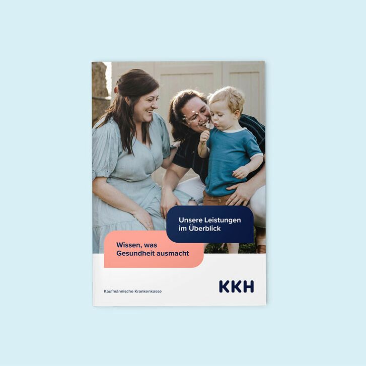
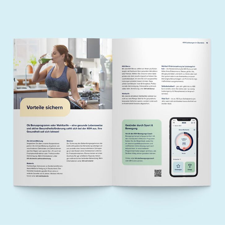
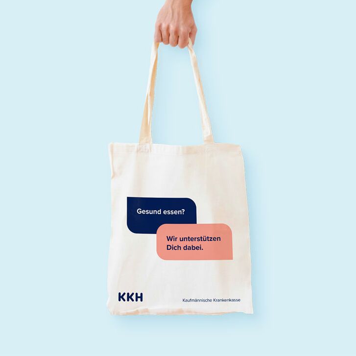
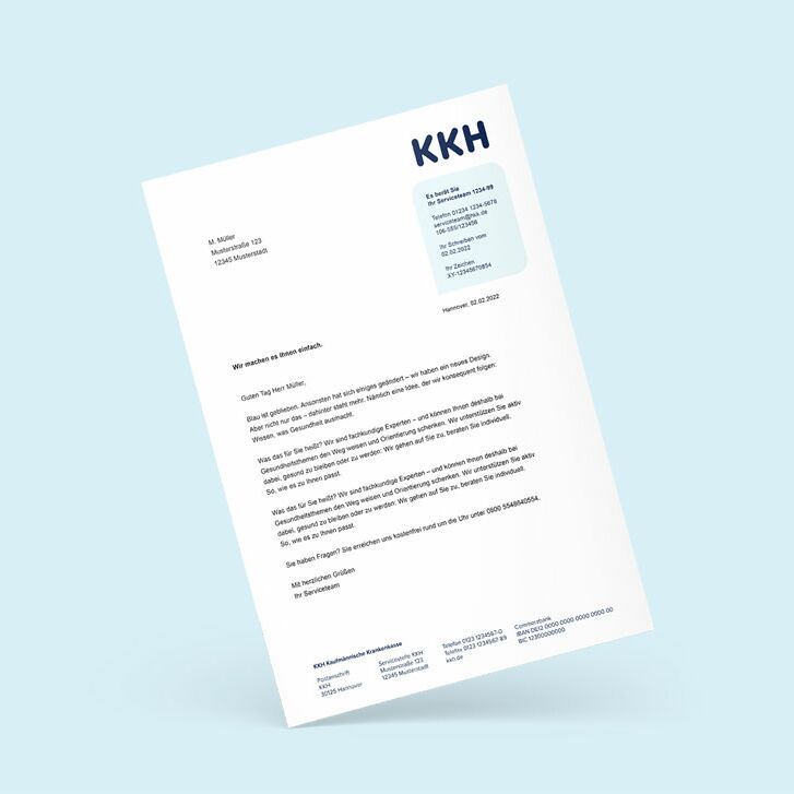
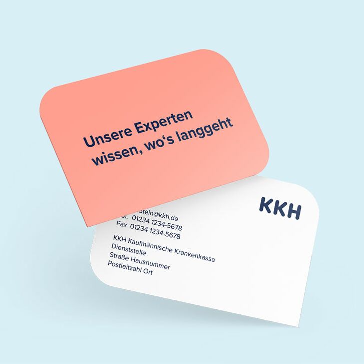
Our Creative Unit developed the new brand design based on the new positioning. A particular challenge was the high number of touchpoints - from the health insurance card to analogue correspondence and online communication. The new design had to be optimised especially for the digital touchpoints, such as the KKH app. There was a lot of catching up to do, as the health insurance company's communication design had not been updated for 20 years.
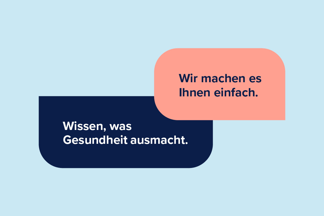


KKH is now characterised by a new brand identity as well as simple and flexible brand codes. A central brand code: dialogue. KKH implements this in its brand behaviour through a particularly dialogical approach to its customers. In terms of design, these are dialogue bubbles for talking to the customer, providing advice and responding to personal needs. The dialogue bubbles serve as a stage for key messages, relevant information and useful tips. The familiar dark blue brand colour is retained and complemented by a warm coral as a contrast. The dialogue-based imagery puts people at the centre. The new design is flexible - and at the same time creates a high recognition value across all media.

Internally and externally: establishing the brand
Today, KKH has a strong, differentiating positioning and a unique design. It visualises KKH's development and conveys its values. We are proud to have developed a new, future-proof brand identity for KKH with our Brand Driven Transformation approach. Future-proof because the new brand positioning was developed strategically and based on data - providing a resilient foundation for future needs.
Stephanie Engelmann
Member of the Executive Board of KKH Kaufmännische Krankenkasse
Awarded
KKH Kaufmännische Krankenkasse has won the German Brand Award twice for its holistic brand relaunch:
- German Brand Award 2024: »Winner« in the category Excellence in Brand Strategy and Creation – Brand Strategy – B2C
- German Brand Award 2024: »Special« in the category Excellence in Brand Strategy and Creation – Brand Revival of the Year
Get in touch with us.
Got a question? Ask us!

Strategie
Daniel Kostyra