Corporate branding system for the leading international discounter
ALDI
SÜD.
In 2015, ALDI SÜD was faced with a challenge: even though the discounter trades under various names in different countries (ALDI SÜD, ALDI, ALDI SUISSE, HOFER), it requires a consistent international brand profile that is visible in individual countries. The ALDI SÜD logo is particularly important, because it serves as a unifying visual element that makes the brand uniquely recognisable. At the same time, the brand must work well in a wide range of visually expressive product worlds, services and (partner) offers. And the individual countries must have some freedom of action for their market-specific presentation.
The design features: building blocks for the corporate branding system
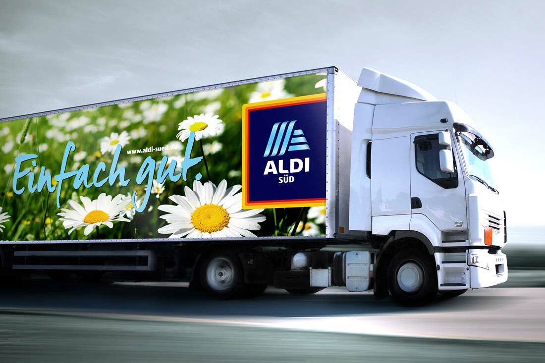
The solution: a new logo – and a flexible corporate branding system. We worked with the designer Armin Illion to develop a logo that is composed of incisive design features. The exciting features that are characteristic of the design were optimised and them supplemented with variable modern components. The result is a versatile combination that enables the individual countries within the ALDI SÜD corporate group to link their own specific identities to the unmistakable appearance of the corporate brand.
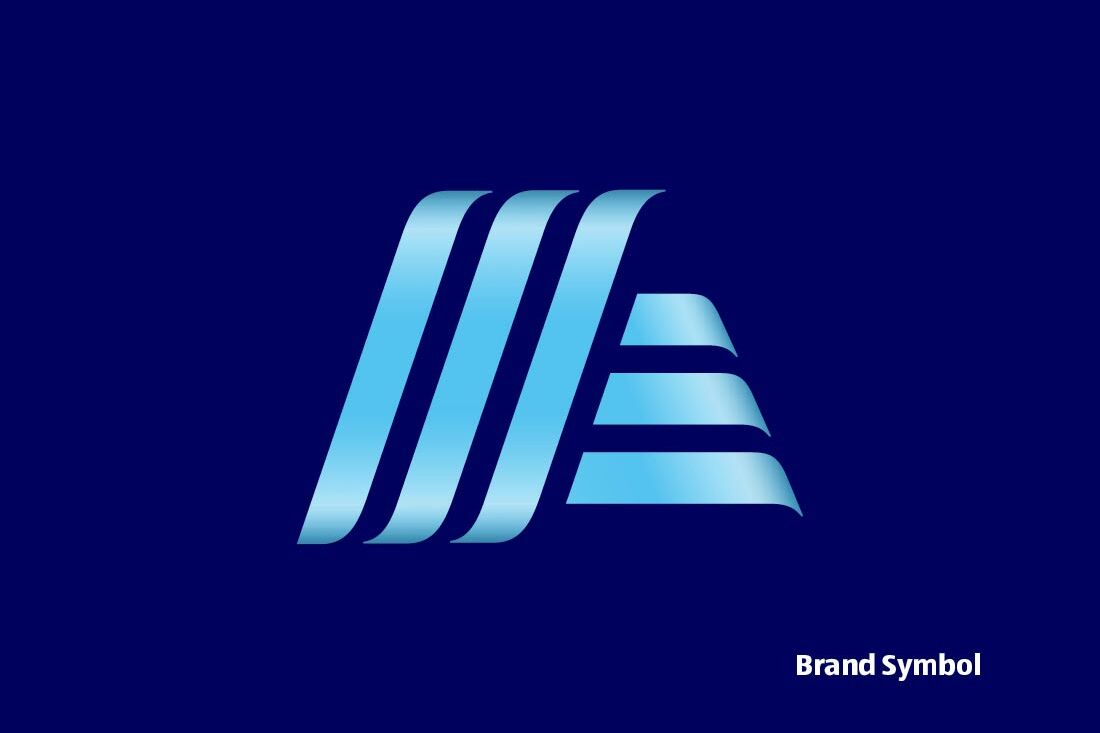
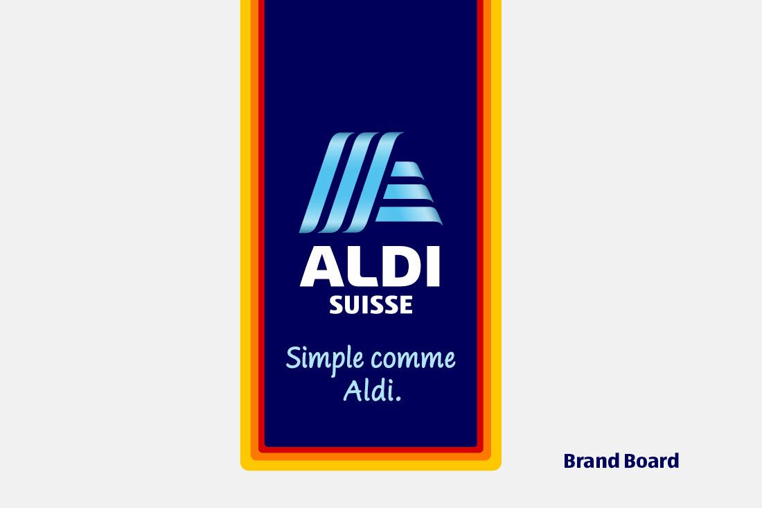
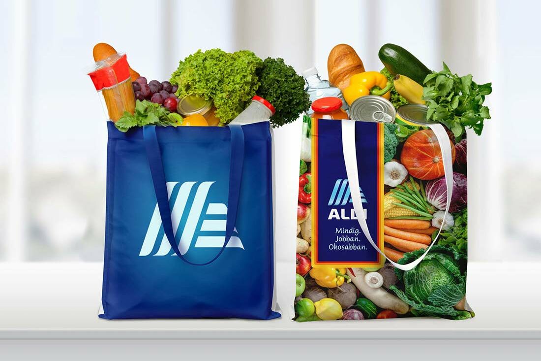
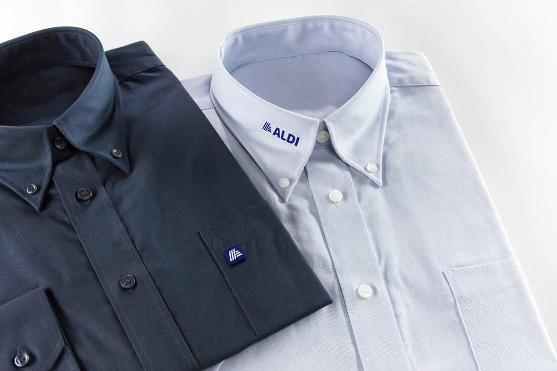
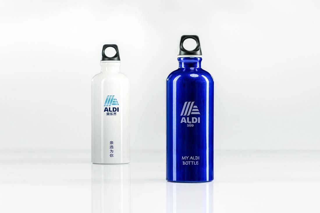
The new logo also comes with a new option: a brand board on which the country-specific slogan can be placed if desired. The striking brand symbol that was derived from the logo can be deployed as a super sign for selected applications. The super sign is independent and is used without the ALDI name. As a result, it becomes a central visual identifier, allowing the name to fade into the background. It can be used flexibly, for example on employee uniforms, as a social media icon, etc.
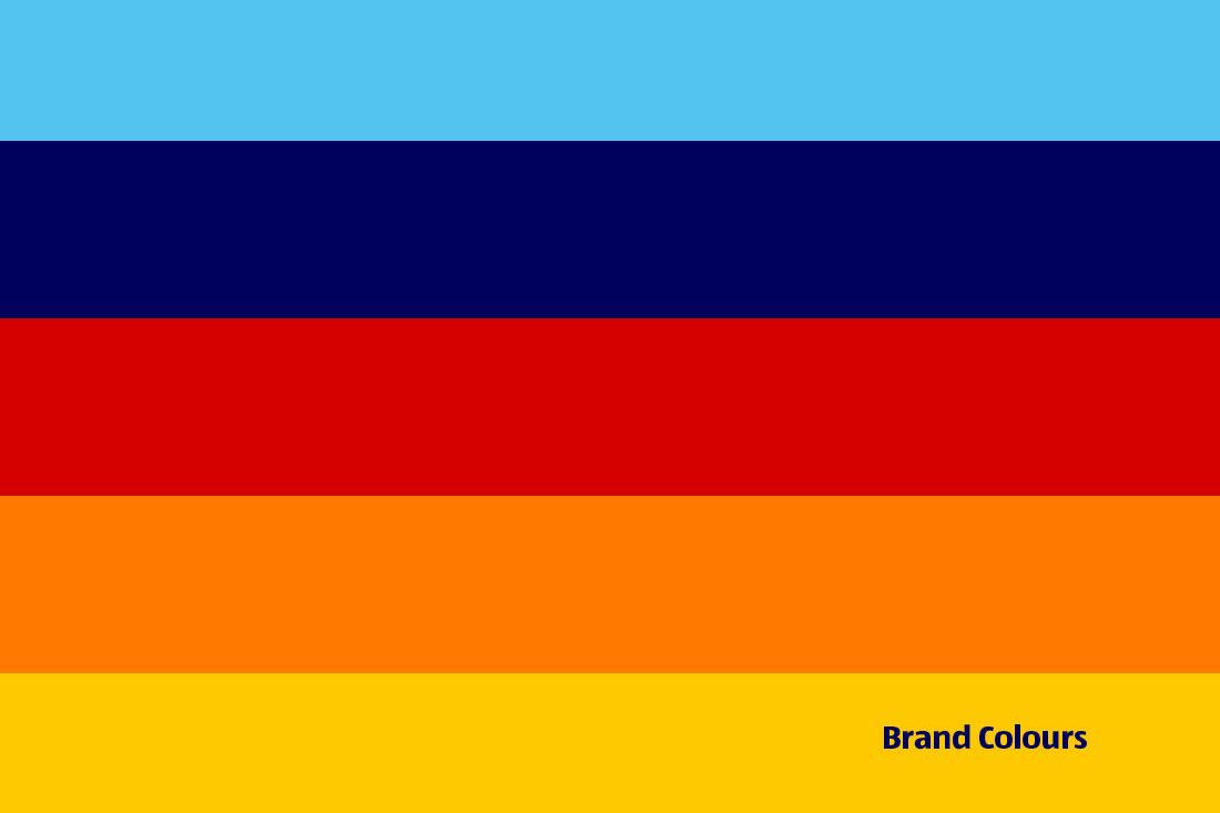
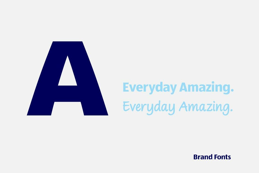
Brand colours serve as additional features that exemplify the brand. The new design elements and our application guidelines ensure a high level of consistency for the ALDI SÜD brand profile – and give the individual countries the freedom they need to satisfy their wide-ranging requirements.
The logo: greater expressiveness and better applicability
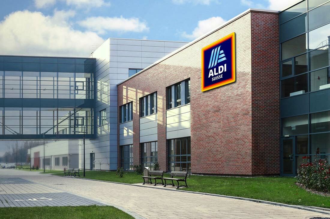
The new logo represents a further refinement of the old logo. The design has been modernised and streamlined, and it can now be used in both a landscape format and a square format. Before 2017, the portrait format was the only version of the logo available. We also developed individual corporate identity logo versions for each country and country group.
A consistent brand profile: applying the corporate branding system


A design with cult status
The ALDImania collection offers an excellent example of just how flexibly these design elements can be utilised. The collection (which has only been in existence since September 2021 and which has already attained cult status) features the brand symbol and brand colours as its central design features. Trendy fashion design – using design features drawn from the corporate branding system that we created in collaboration with Armin Illion.